
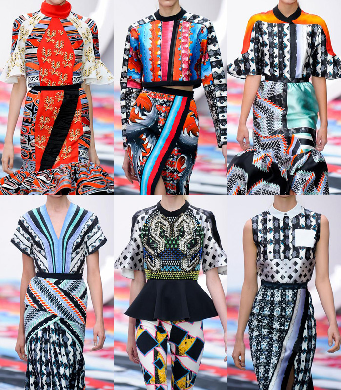
Summer 2013 is well underway and one of the big trends we are seeing is mixing patterns. A power clash of colours, patterns and prints are taking over. It is such a strong trend that it even continues into the fall 2013 collections that will soon be arriving in stores.
How do you mix patterns when fashion has taught us so well how to match colours and even to never mix patterns? As we all know in fashion, things come and go in cycles. This time around if you want to wear this trend well, remember it is best to be sure your patterns have different sizes. For example wearing a small pattern on top with a bigger one on the bottom. This ensures that it looks like you took the time to actually create this mismatched feel. You don’t want to look like you aren’t aware or like you just threw on anything that was in the closet without any thought behind it.
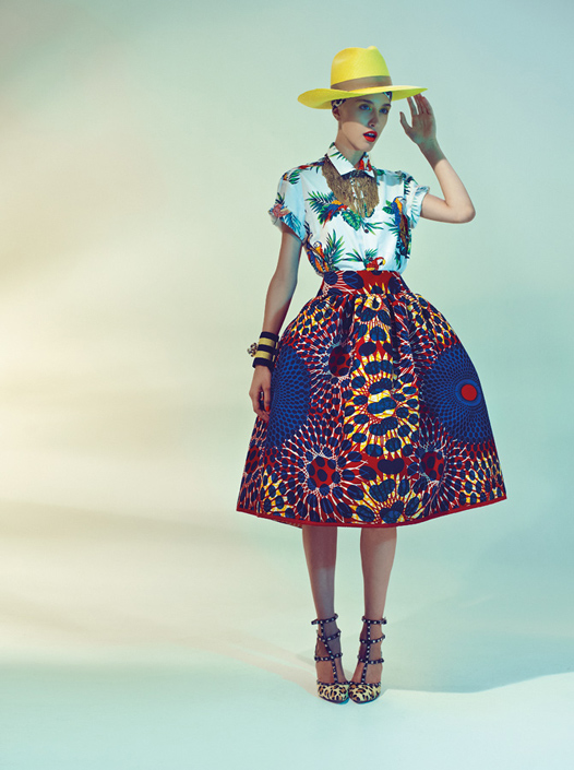
Also selecting patterns that may have one or two similar colours can also create a unified look. Like in the Stella Jean look pictured below with the full blue skirt and white top. Both have a bit of red in the patterns which brings it together despite the designs being complete opposites of each other. Summer is the perfect time to experiment with bright colours and bold patterns so take advantage of this trend and have fun.

[…] © Life With Ivy […]
LikeLike